 I’m going to be honest with you. Of all the projects I’ve created to date, this one tops my favorites list. You might be thinking, ‘Dude, what? It’s just a hyper-casual mobile game… how can it be your favorite project?’
First of all, it’s not crappy! It’s wonky, and that’s something entirely different. Secondly, it’s not just about the game itself; it’s more about the journey it sparked.
In 2016, major Slovak tech companies Pixel Federation, Sygic, and a nonprofit organization LEAF launched a five-month-long educational program aimed at teaching young people how to succeed in the global market—Butterfly Effect. Since this page is dedicated to the game, I’ll skip the details. Here’s a TL;DR:
Five months, six people, a lot of learning from pros, extensive coding and designing => a spin-off project for one of Pixel Federation’s original IPs
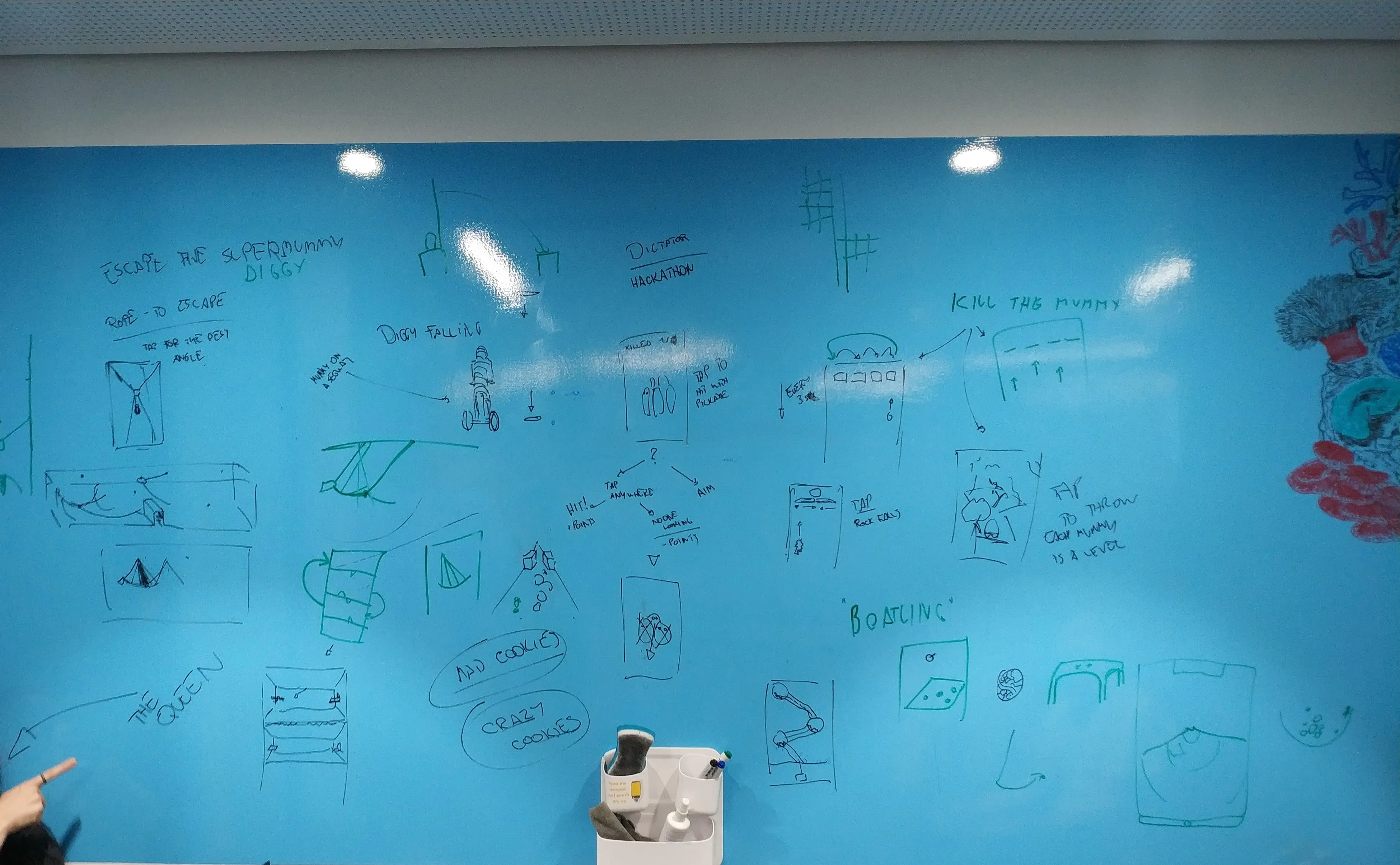
So, yeah. The task was simple: create a hyper-casual game loosely based on one of Pixel’s existing games. We developed numerous prototypes in the first month, and it was tough to decide which direction to pursue (though looking back at old photos, the ship theme was a favorite from the start). Here’s a small compilation of some of the prototypes we created:

The prototypes were fun to experiment with, but they didn’t quite capture the hyper-casual essence. At that time, most hyper-casual games required minimal skill or input to play.
We needed something that:
- Is easy to learn but difficult to master.
- Has simple controls.
- Can be designed quickly and can incorporate numerous levels without excessive development time.
Two prototypes made it to the final round:
- “Diggy and Friends” – Unfortunately, I couldn’t find a GIF, but imagine a game similar to those where you stack a ton of characters and navigate through simple mathematical gates(there weren’t any gates or maths in our game, but perhaps it could have evolved to include them. We could have been pioneers in that genre, darn it!).
- Cargo Ship Stacking – Guess which one we chose :)
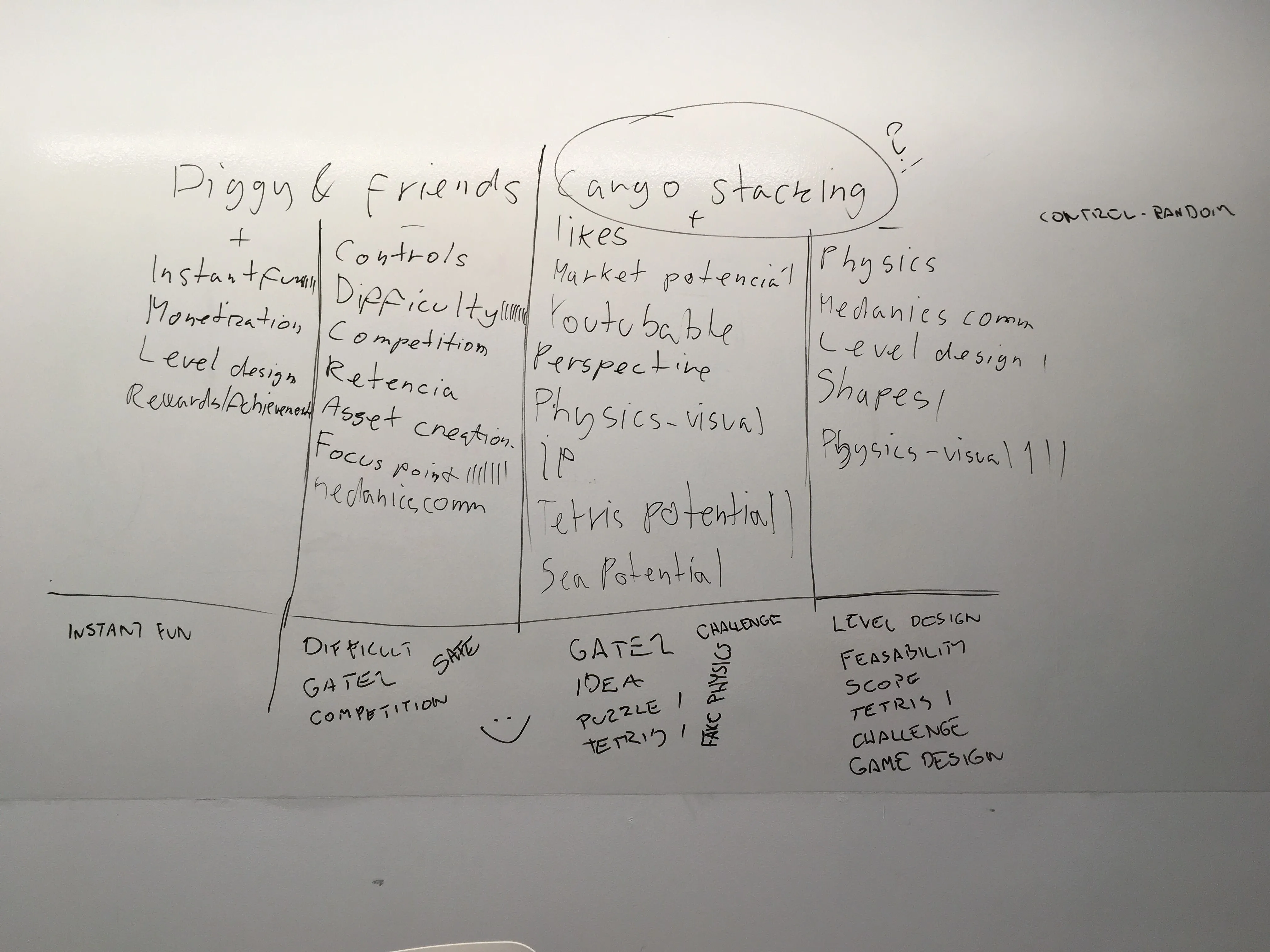
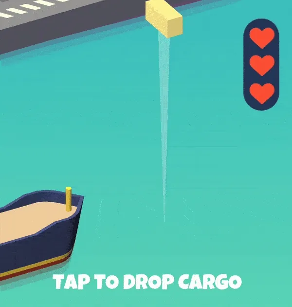
Cargo Ship Stacking had it all: simple levels at the beginning, super simple controls (just one tap), and a design process streamlined enough for us to create about 100 levels in quite a short time.
Buoyancy
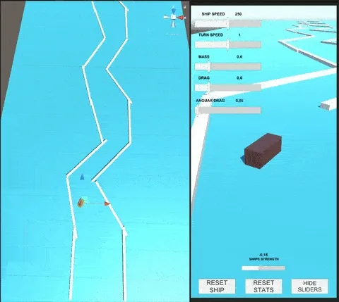
Implementing buoyancy was quite simple and straightforward (though we did improve it later, but I’ll get into that later). Each ship consisted of a big box collider that defined its floating width and height (and a lots of smaller box colliders to define the ship’s shape). We segmented the size of the ship into buoyancy voxels. The more voxels we had, the more precise our buoyancy became—though, naturally, it also had a fair share of performance hit after a certain amount of voxels. If I recall correctly, we tried to limit it to six pairs of voxels per ship.
We then established the water level, and during each physics update, we calculated the necessary force to apply to each voxel based on several factors:
- Whether the voxel was submerged in water
- The voxel’s velocity
- Water density
- & Certain dampeners to keep the gameplay fun
This approach was relatively simple, but it had its limitations, which we were okay with, as the game was designed to be very simple, and not realistic.
Cargo
I remember our very first idea on how to approach cargo: having the cargo look abstract and represent Tetris-like shapes. But woah, that stuff got too complicated quickly (in terms of gameplay).
So, back to whiteboard - we experimented with simple containers that would change their orientation each time they bumped against the ends of the “crane”. Players liked this feature, but they found it frustrating to wait for the container to reorient if they missed their chance to place it correctly.
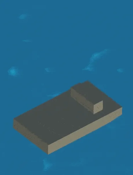
Ultimately, we decided on simple one color containers but each with different “abilities”. That’s when the real fun started.
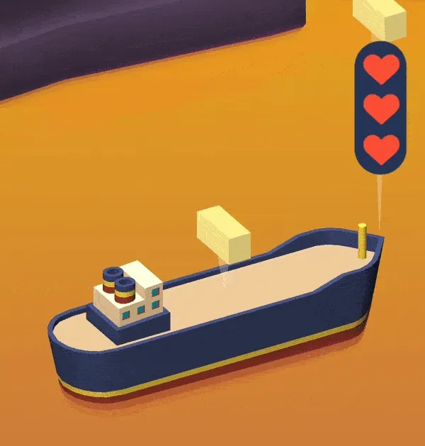
I don’t have the Game Design Documents (GDDs) from the game anymore, but from what I remember, we implemented these containers into the game (not listed in the order they were unlocked):
- Normal
- Heavy
- Bouncy
- Icy
- Explosive
- Magnetic
- Anti-Magnetic
- Sticky
Chapters & Difficulty
The game features six chapters, and each one introduces at least one new type of cargo. In addition to new cargos, each chapter also brings in new ships and its own distinctive visuals.
Now, I’m not a game designer, so I’ll explain this in very layman’s terms: the difficulty increased linearly. However, at the start of each chapter, the difficulty was reduced to about 75% of the previous chapter’s, then gradually ramped up again. Some stats
Some stats
Since 2019, the game has averaged about 10-20 organic installs per day, totaling around 20,000 installs. We didn’t use interstitial ads, but players could watch a rewarded ad to skip a hard level. This generated about 100€ from Unity Ads. Our first test in 2019 resulted in a cost-per-install (CPI) of about 60-70 cents. We tested it again when the Evergreen ship got stuck, which then yielded a CPI of about 1.1€, I believe.
Cargo Ship Stacking 2?
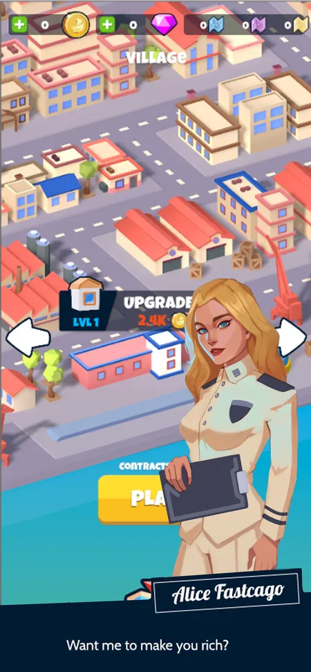
Late 2020 to early 2021, we started prototyping a second version of the game, this time with a more casual-focused gameplay, you might even call it hybrid-casual. The core concept remained largely the same, but with significantly improved buoyancy, and new features like quests and a manageable city.
However, as other priorities emerged and considering the first version’s declining numbers, we decided to shelve this project. Surprisingly I couldn’t find almost any normal footage out of it, so I’ve tried to spin up the Unity project, couldn’t boot the game as the server holding all the addressables (for ships and other stuff) was shut down 3 years ago (again, that was a prototype, and it was already bigger than anticipated, as at that time, we had no experience server provided addressables and wanted to try it out - having it work without a server was way down our list of things to do). So here’s one screenshot from the time we started to work on characters:
